
Nestle Polo
Can we update an iconic package without losing what made it distinct?
2016
Industrial Design

About
A series of packaging concepts, designed for Nestle's Polo brand, "The Mint with the Hole". Nestle was planning on introducing a newer, more premium pack, and approached FITCH to help with the design.
The designs played around with the existing brand language, including the iconic shape, the existing packaging and the fun, quirky tone of voice. The designs were modeled in Rhino and then rendered in Keyshot.
Design Routes
Pocket Pack: A simple pack. Twist to get one mint, and the pack springs shut.
Flip top: A translucent plastic flip top pack.
Round Tin: A simple tin, with a design derived from the shape of the mint.
Stick: Inspired by the packaging of glue sticks. Twist the bottom to get a mint.
Square Tin: A simple square tin, but with graphics chopped up from the key-line drawings of the old pack.
Carousel: A larger pack meant to be kept on the desk. Twist the top, and a mint pops out

Pocket Pack

Flip Top

Round Tin
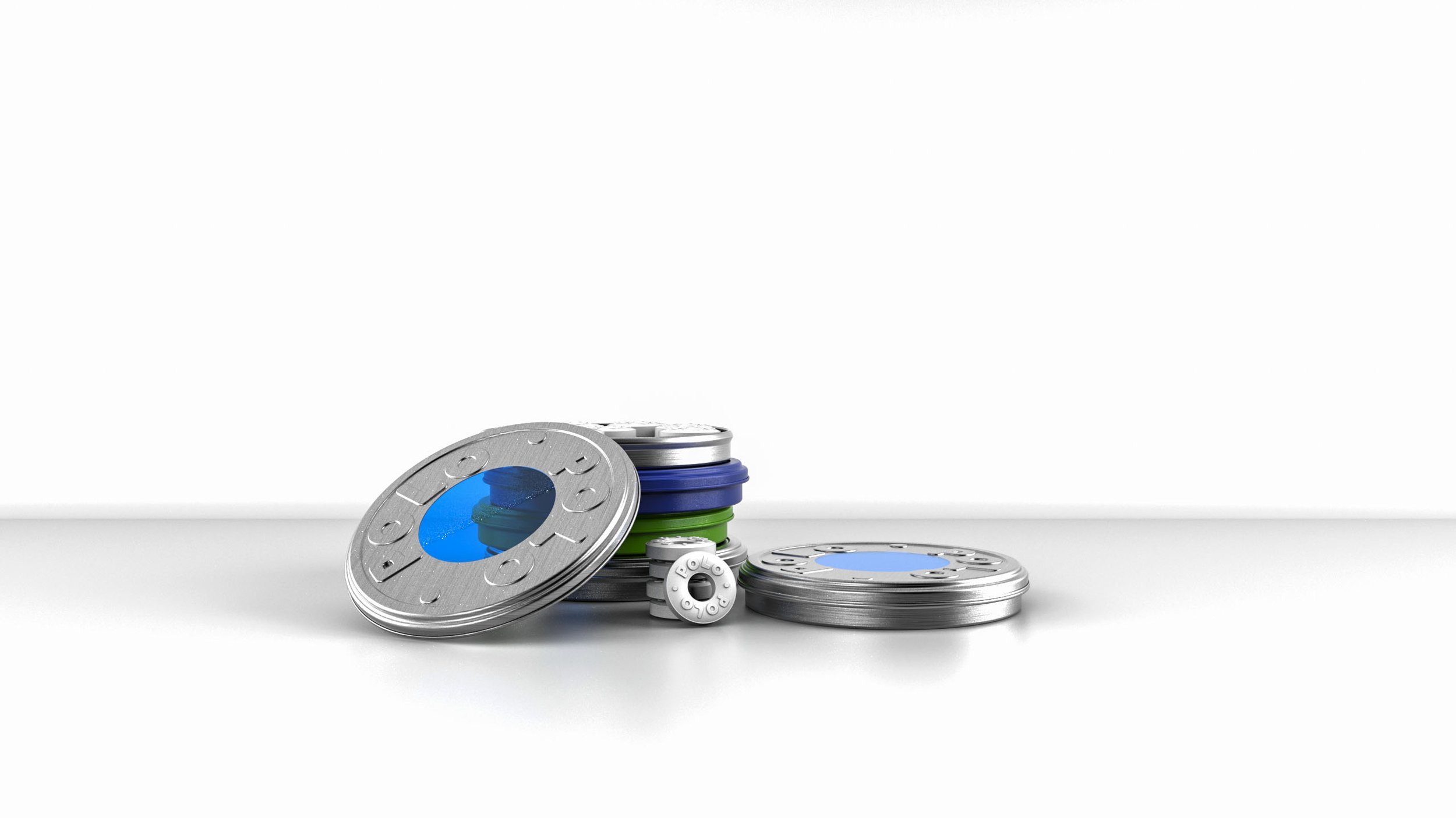
Round Tin

Stick

Square Tin

Square Tin

Carousel
Comparison