Domino’s Pizza
Creating an inviting dine-in experience for the pizza delivery experts
2018
Experience Design
About
Domino's in India is well known for their take-away and home delivery, built off their promise of "30 Minutes or Free"; but customers were never really satisfied with their dine-in experience. Jubilant Foodworks approached FITCH to re-think and re-design the entire restaurant concept.
The whole space was given a new, ground-up re-design, to better align with the warm, authentic, family-friendly tone of voice of the brand, and to make the restaurant stand out amongst the competition in the QSR space. The kitchen space was optimized, and materials and lighting were chosen to fit the theme, as well as the budget, to allow the experience to be replicated across the country. The entire concept was then adapted to different formats, ranging from food-courts to multi-storey flagships.
Discover & Define
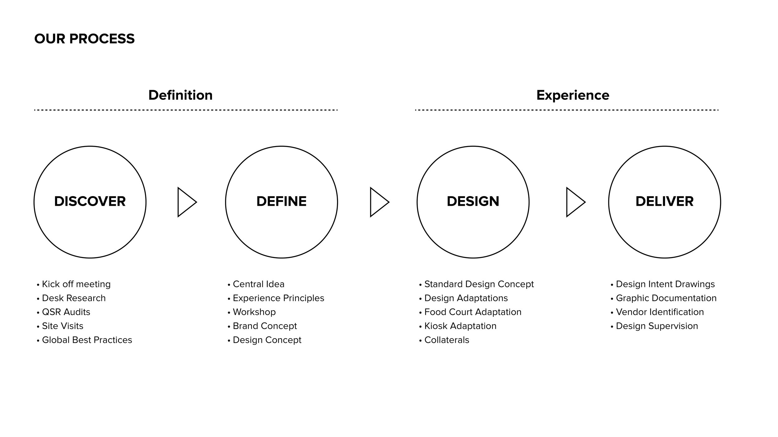
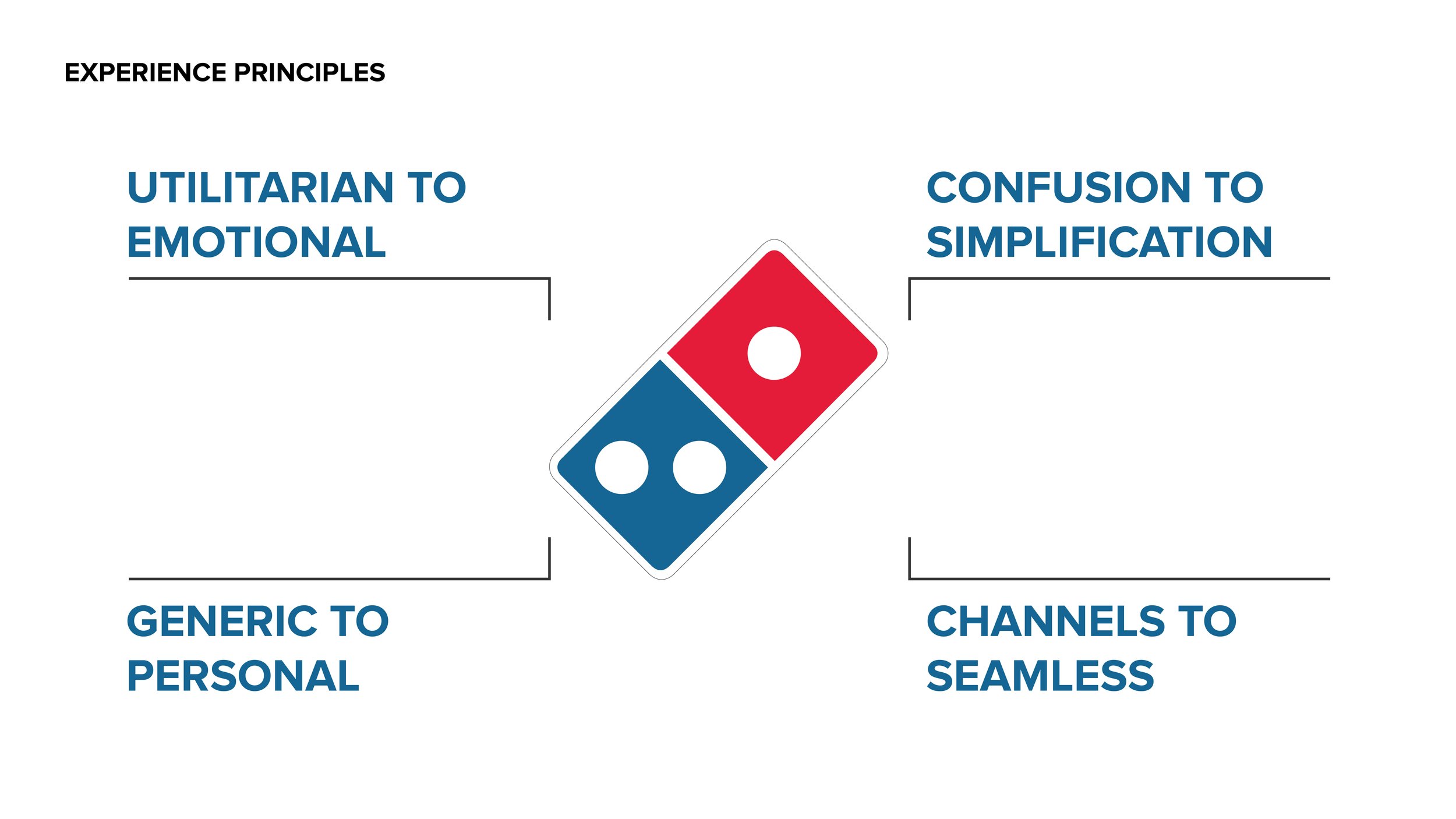
The project began with a Kick-Off meeting to ensure alignment between the client’s objectives and the project team. This was followed by the discovery phase, which included desk research to find the best practices in the space, audits of other Quick Service Restaurants and audits of various Domino’s restaurants across the country. Our insights from this phase were distilled into a central idea and a set of experience principles.
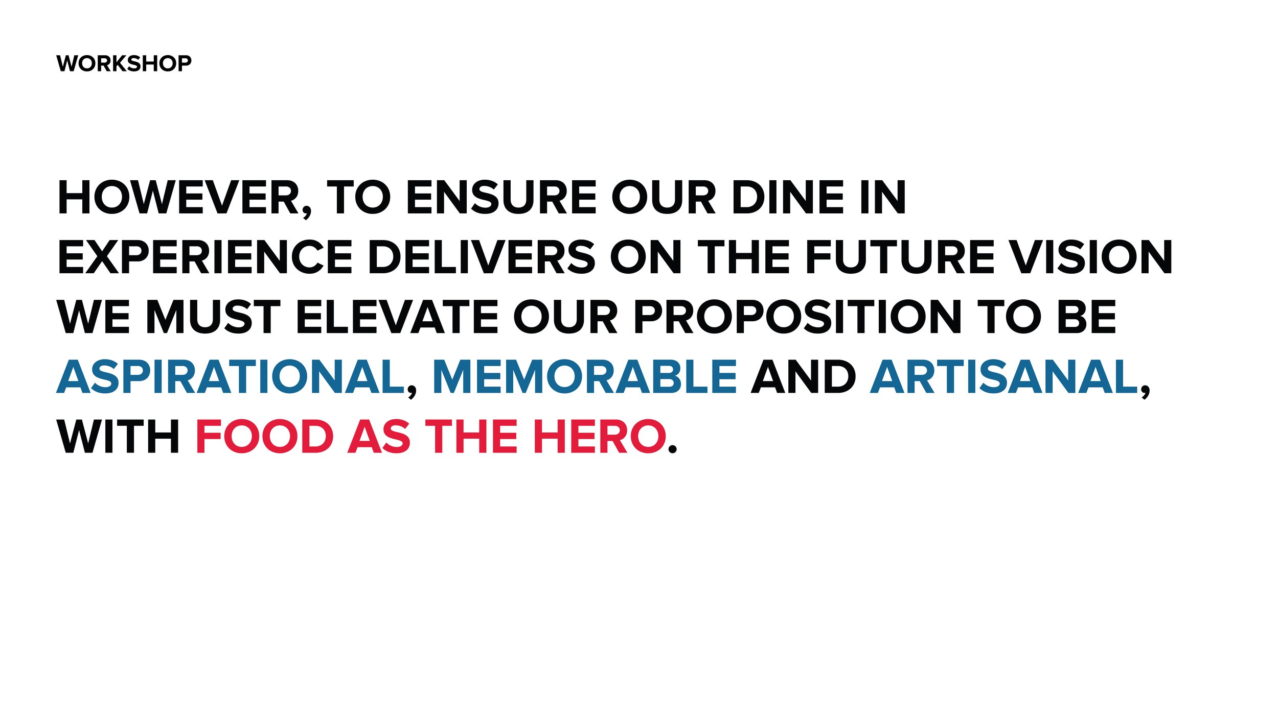
After this, a workshop was help with the client team to look at how these experience principles would transform the brand. The outputs from this workshop defined the brand concept, which in turn defined the design concepts.
Design Concept
The entire kitchen space was opened up to form a live "Pizza Theatre", and all the equipment had to be re-designed to be visually appealing, without any major disruptions to the cooking process.
Technological interventions were also explored, improve the customer journey, and digital ordering kiosks were incorporated into the new design. The dining area was divided into a "Quick-stay" area for takeaway customers, and a "Pizza Pavilion" for larger families. Materials, lighting and design were used to differentiate the spaces, while ensuring the concept worked well as a whole.
Design Adaptations
The materials needed to be warm, durable, readily available, and cost-effective; while also fitting the warm aesthetic, and more modern design language.
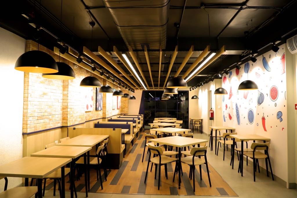
The ceilings were kept open, with services painted black to reduce prominence. A darker shade of the Domino’s blue was used for the facade, frames and seat cushions, while the rest of the palette was filled out with white paint and light wood laminates. The pizza pavilion was differentiated with wooden rafters, wooden finish tile floors and brick walls, to provide an extra layer of texture.
The design was executed in 2 sites: One in Bangalore (Shown above) and one in Jalandhar (Shown below).


